Giving Campaign Identity

Campaign Identity & Graphics Design
Project Overview
My goal was to create visually compelling materials that highlighted the extraordinary power of our sisterhood. The campaign's striking graphics and cohesive design contributed to an impressive 835.45% increase in funds raised, over 500 new donors, and 150+ repeat contributions.
Client
Red Wine & Blue
Tools
Adobe Illustrator, Adobe Photoshop, Figma
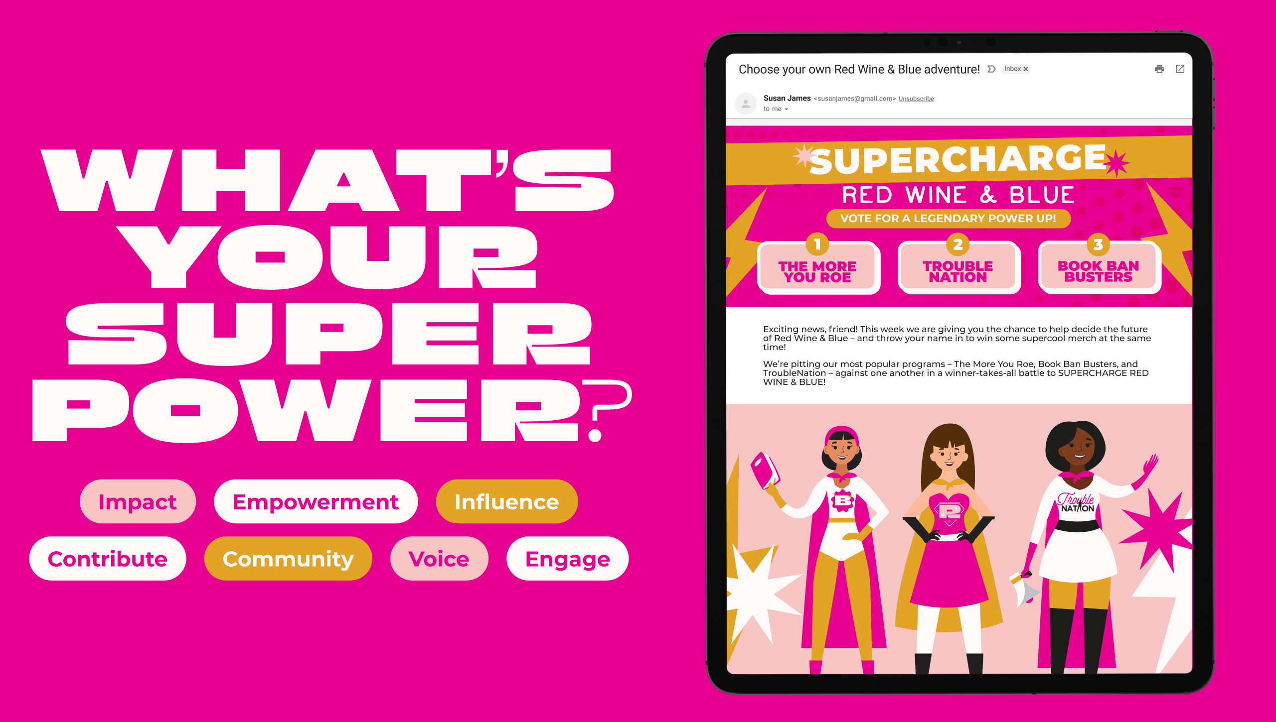
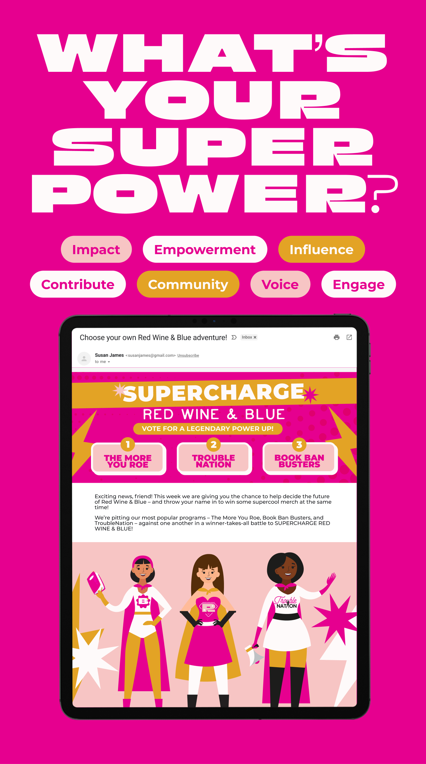
A promotional graphic for the 'What's Your Superpower?' campaign. The background is bright magenta with large, bold white text at the top that reads 'What's Your Superpower?'. Below, various words such as 'Impact', 'Empowerment', 'Influence', 'Contribute', 'Community', 'Voice', and 'Engage' are displayed in colorful speech bubbles. At the bottom, there is an image of a tablet screen showing an email titled 'Choose your own Red Wine & Blue adventure!' with the text 'Supercharge Red Wine & Blue' and options for voting on different programs. Three illustrated women in superhero costumes are also featured.A promotional graphic for the 'What's Your Superpower?' campaign. The background is bright magenta with large, bold white text at the top that reads 'What's Your Superpower?'. Below, various words such as 'Impact', 'Empowerment', 'Influence', 'Contribute', 'Community', 'Voice', and 'Engage' are displayed in colorful speech bubbles. At the bottom, there is an image of a tablet screen showing an email titled 'Choose your own Red Wine & Blue adventure!' with the text 'Supercharge Red Wine & Blue' and options for voting on different programs. Three illustrated women in superhero costumes are also featured.

The Design Vision Behind "What's Your Superpower?"

For the "What's Your Superpower?" campaign, I aimed to create a vibrant and empowering visual identity that seamlessly integrated with the existing brand. By using the brand's signature salmon color, alongside bright magenta and golden yellow, I sought to inspire hope and convey a sense of collective strength. The chosen color palette was intended to energize the audience and emphasize the campaign's message of community-driven impact.

In terms of typography, I maintained brand consistency with Montserrat while incorporating Tate and Gabriella to add a distinct flair to the designs. The imagery included familiar faces from the staff to foster a stronger connection between the brand and its community. Additionally, I utilized symbols like stars and lightning bolts to represent the organization's superpower, reinforcing the campaign's empowering tone and style.
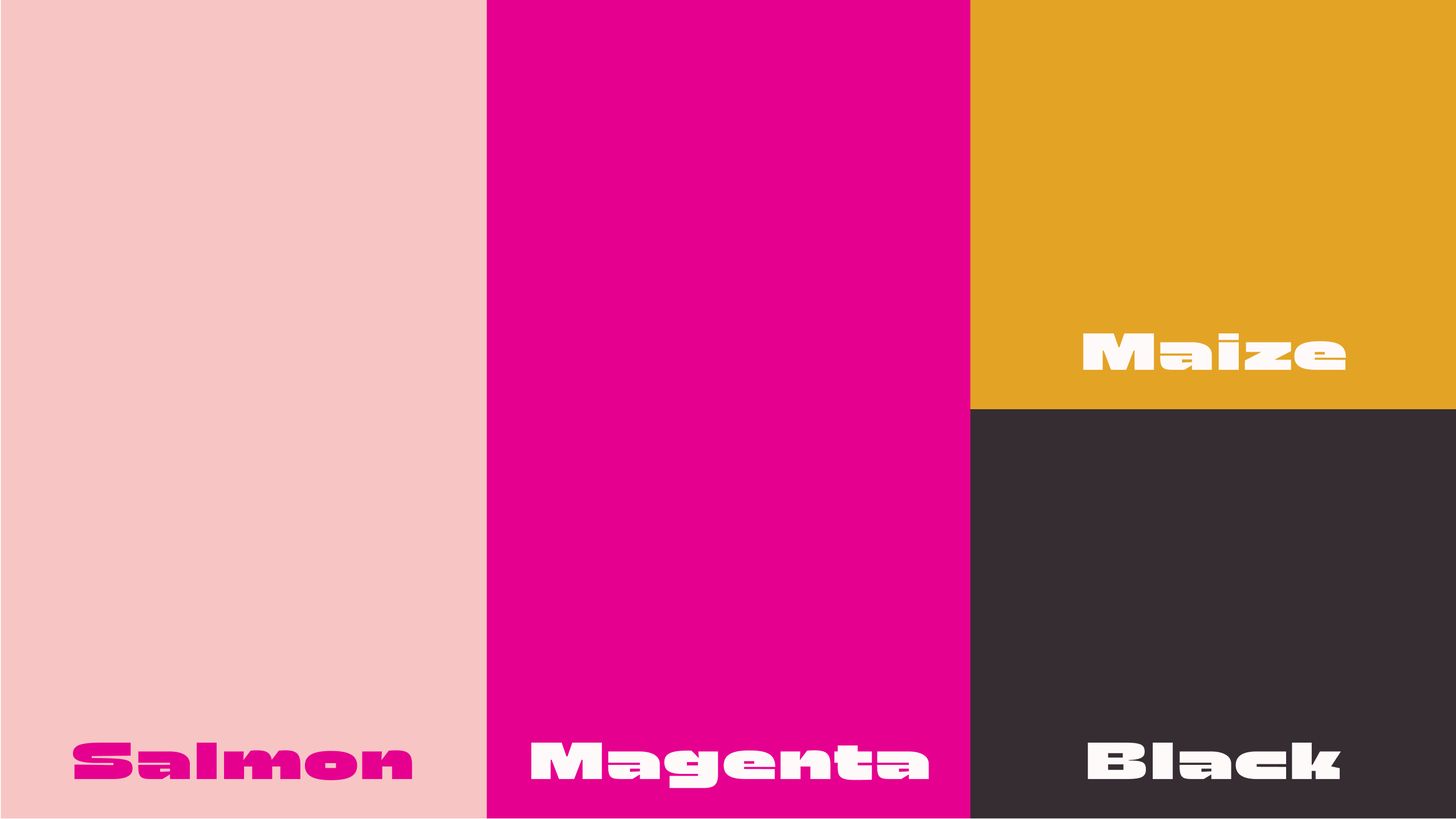
A color palette for the 'What's Your Superpower?' campaign featuring four colors: Salmon, Magenta, Maize, and Black. The Salmon color is shown on the left, Magenta in the middle, Maize at the top right, and Black at the bottom right. Each color block is labeled with its respective name in a bold white font.A color palette for the 'What's Your Superpower?' campaign featuring four colors: Salmon, Magenta, Maize, and Black. The Salmon color is shown on the left, Magenta in the middle, Maize at the top right, and Black at the bottom right. Each color block is labeled with its respective name in a bold white font.

Learnings & Future Opportunities

One of the key learnings from the "What's Your Superpower?" campaign was the importance of cohesive content alignment. By ensuring that all graphics and content matched and aligned seamlessly, we were able to create a unified and engaging visual experience for our audience. This consistency, achieved through meticulous graphic design, played a crucial role in tying the entire project together and enhancing its overall impact. Additionally, the implementation of structured project management practices ensured that graphics were produced and shared efficiently, despite the rapid turnaround requirements.

Looking ahead, there are several exciting opportunities for future projects. Building on the success of this campaign, I am eager to explore the incorporation of more diverse content types, including videos and animations. These dynamic elements can further engage the audience and provide new avenues for storytelling and connection. Furthermore, the new file management system introduced during this campaign will facilitate smoother collaboration and archival processes, ensuring that all assets are easily accessible for future use.
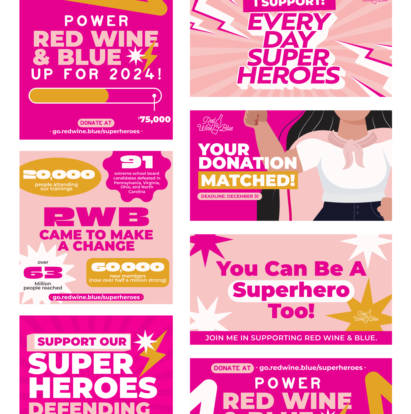
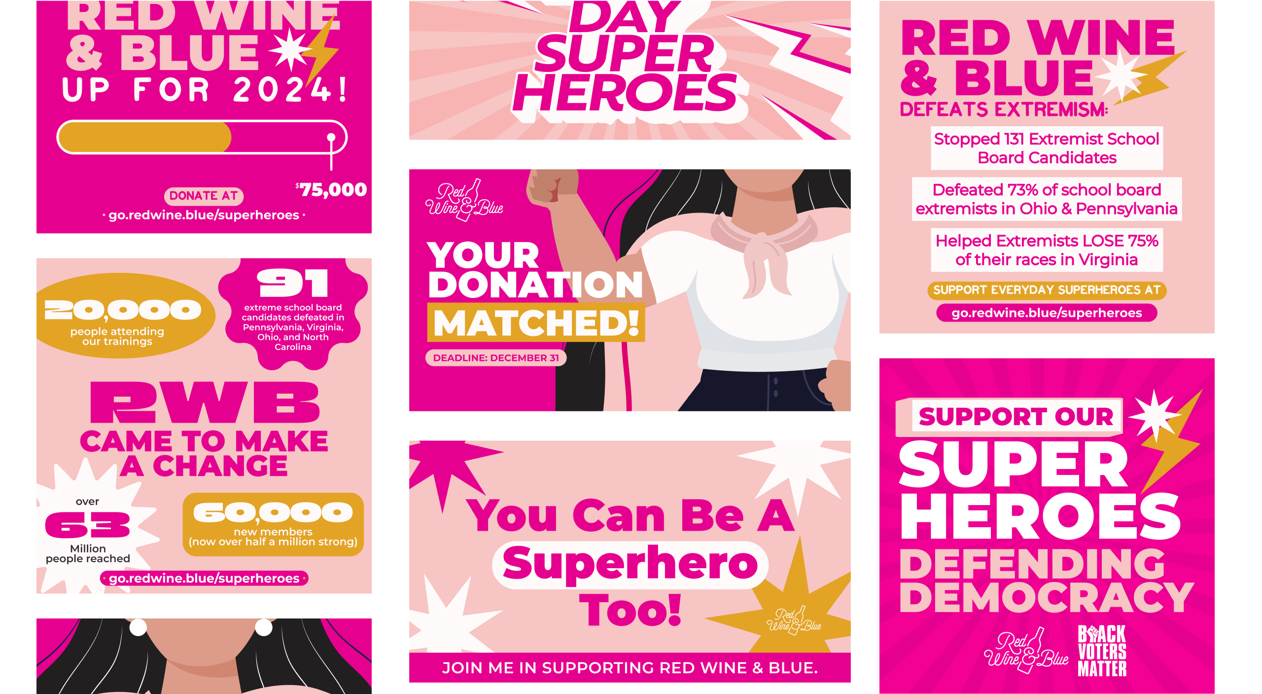
For alt text, it's important to strike a balance between being descriptive enough to convey the essential information and being concise. Here is a more concise version:

"An array of promotional graphics for the Red Wine & Blue 'What's Your Superpower?' campaign. The graphics feature bold colors, superhero-themed elements like stars and lightning bolts, and phrases such as 'Power Red Wine & Blue up for 2024!', 'Your Donation Matched!', 'You Can Be a Superhero Too!', and 'Support Our Superheroes Defending'. Key statistics highlighted include '20,000 people attending our trainings', '91 extreme school board candidates defeated', and '63 million people reached'."For alt text, it's important to strike a balance between being descriptive enough to convey the essential information and being concise. Here is a more concise version:

"An array of promotional graphics for the Red Wine & Blue 'What's Your Superpower?' campaign. The graphics feature bold colors, superhero-themed elements like stars and lightning bolts, and phrases such as 'Power Red Wine & Blue up for 2024!', 'Your Donation Matched!', 'You Can Be a Superhero Too!', and 'Support Our Superheroes Defending'. Key statistics highlighted include '20,000 people attending our trainings', '91 extreme school board candidates defeated', and '63 million people reached'."

Past Work